Graphical patterns for trading are real science. And if you are just beginning to study it, this article will help you start earning well. Our team also collected information that will be useful to increase the efficiency of transactions with the purchase or sale of digital assets.
Let’s figure out what Crypto Chart Patterns are! We will determine how they work, learn the terms and the templates of the best crypto patterns, tested by traders from around the world. We will help you make your deals always profitable.
Let’s understand the schedules of the crypto patterns
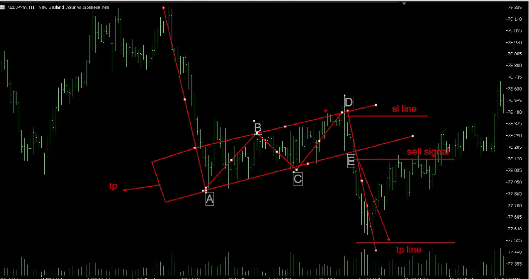
Everyone who entered the cryptocurrency exchange has seen a scheme similar to this:
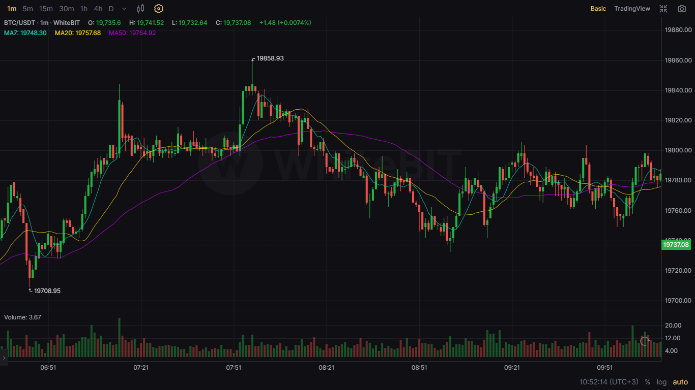 Beginners most often cannot figure out such cryptocurrency diagrams. But this is not scary, because even savvy users experience difficulties in reading such graphs.
Now we’ll tell you in more detail what is it. There is a candle cryptographic in the picture above. It analyzes past prices and offers the following options. It’s obtained after buying and selling a particular digital currency. There are situations when prices «hang» between levels. At this moment, the schedule of the crypto pattern is compiled.
We mean:
Pattern price crypto is variability that is successfully working on the cryptocurrency market.
You may have a question: why do you need to look at the transactions that have already taken place? And we understand why so. After all, there is no obvious information about transactions that will be concluded in the future. But in fact, only inexperienced traders think so. And you need to understand the work of cryptocurrency patterns.
The fact: there are all the data that will be useful to a successful trader on diagrams. Here you can see the trends of the crypto market that relate to the specific currency. Remember: knowing such information will help you conclude a successful deal.
Candles
Crypto patterns are also called «candle charts». There are color indicators in such schemes. They look like candles.
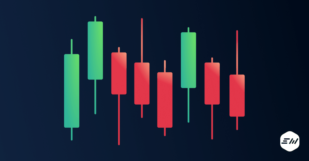 Each candle depicts a period selected by the trader. The timeframe is exposed depending on the desire of the user and has no clear restrictions: it can be several minutes or a couple of months.
There are two candle parts: body and shadow.
The body of the candle consists of prices that were on opening and closing for the selected period. If the green color is depicted, then the price grew (bull movement). The red candle is an indicator of a decrease (bear movement).
Shadow
There is a shadow (another name: wick) on each candle. It looks like thin lines that repeat the body in color. You can see it above and below the candles or on one side.
How to read candle shadow?
This is the maximum and minimum price for a selected time.
Using the upper shadow, you can read the maximum price. The lowest threshold is depicted below.
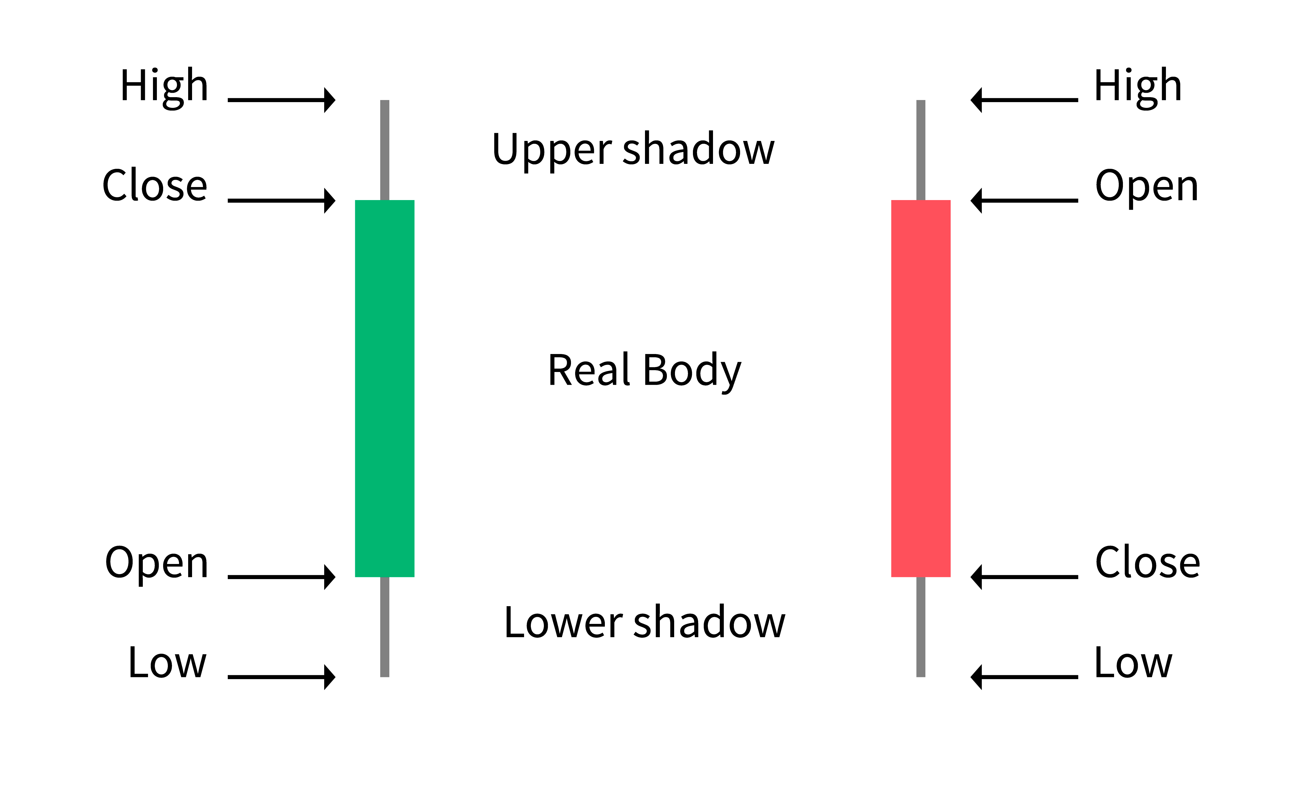
The Doji candle is an indicator that shows only the shadow of a candle without a body. Sometimes the price of opening and closing are equal. Most often, market indecision follows this. Therefore, you can expect a rapid decrease in prices.
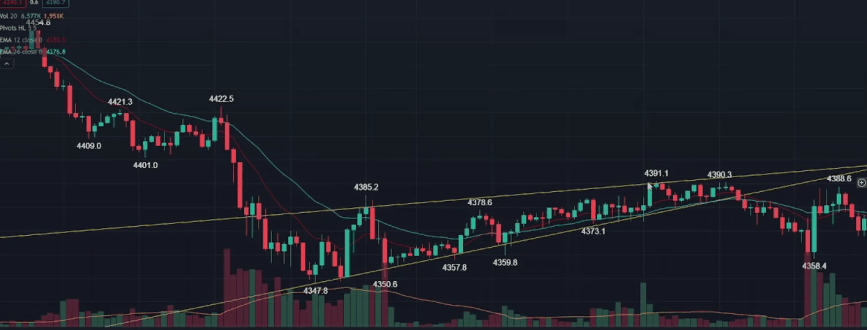
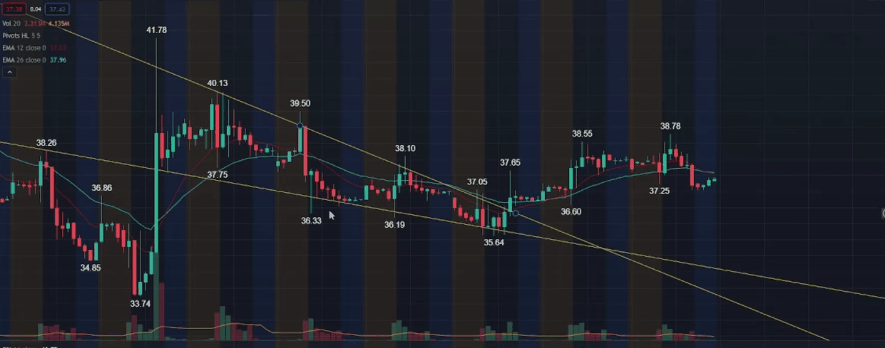
The most popular graphical patterns for trading in the crypto market
There are many patterns in the modern crypto market. And remember that there are no guaranteed «tested» patterns. They work with the same probability. But some of these charts are considered by traders to be particularly accurate.
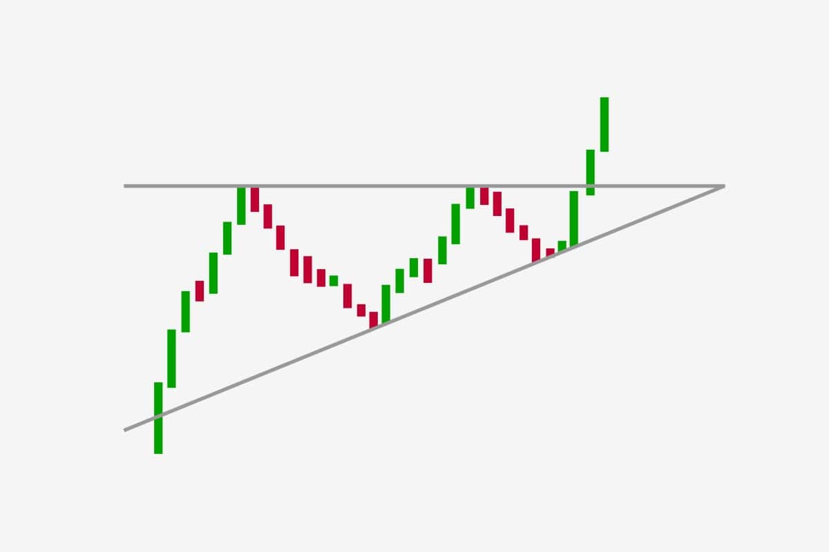
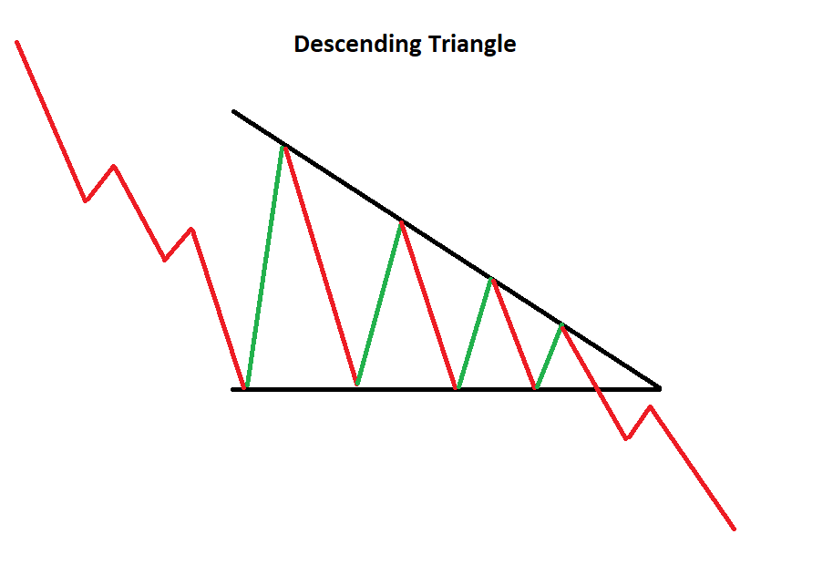
Triangle
The triangle is one of the most popular patterns. It’s on every chart. There are several types of triangles:
- ascending,
- descending,
- symmetric.
If you see a triangle and read it, you can make a good profit.
Ascending triangles
An ascending triangle appears when the price makes high or low. It will most likely continue to grow.
Descending triangles
The descending triangle is a bearish continuation pattern. It appears when the price makes lower highs and lower lows. It’s best to sell assets.
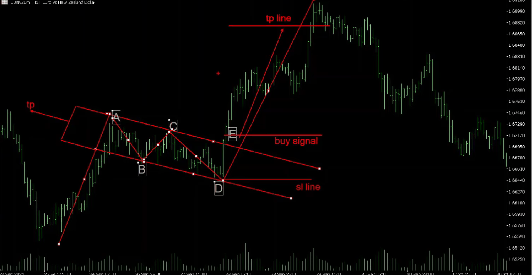
Symmetrical triangles
Symmetrical triangles can be found on two trend lines converging at one point. They are bullish and bearish.
A symmetrical triangle appears after making higher lows and lower highs. The graphic pattern is located at the end of the trend and means a price change.

Bullish and bearish flags
The flag appears after a sharp price jump up or down. It heralds a period of consolidation. There is a sharp spurt in the direction in which the big stocks are moving.
Flags are bullish and bearish. They look like a continuation or reversal.
A bull flag is a pattern that appears after the price reaches a certain level and then changes course. A bullish flag signals buying.
 The bearish flag is the opposite. It appears after a sharp downtrend and consolidation with a high. After that, the price tends to drop.
Rising or Falling wedge
Wedges appear after price drags between two trend lines. This phenomenon is ascending and descending.
A rising wedge looks like a line between two up-sloping support and resistance. The support is more curved than the resistance, and the asset will continue to fall.
 The falling wedge is located between the lines sloping down. In this case, the resistance is more curved than the support. Most likely, the price of the asset will continue to rise.
Rising and falling wedges are called «reversal patterns». In the first case, it’s a bear market, and in the second it’s a bull market.
Hammer or Inverted Hammer
The hammer consists of one candle, and you can see it near the extreme points. It’s a reversal pattern. This figure means a possible market reversal. Before looking for a hammer on the real diagram, take a look at the one shown by us. Otherwise, you can easily make a mistake.
The correct chart appears with a long handle (candle shadow) on one side only. From above, you can see a small ponytail. The candle body of the hammer is very short with a long lower shadow (if the figure is inverted, it will be on top).
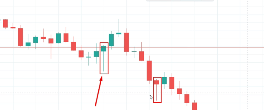
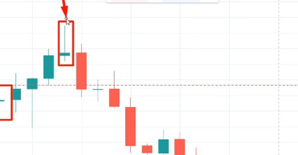 The Hammer starts a price reversal in the opposite direction.
Conclusion
Remember that no one can guess the direction of the market, as it defies logic. Candlestick patterns are no exception.
All charts highlight different trends in many markets. Some patterns are great for a bull market, while others are great for a bear market.
Most crypto traders use popular graphical patterns for trading to analyze the market and make deals. But first, run your backtests. So you can choose the right crypto chart template for you.